
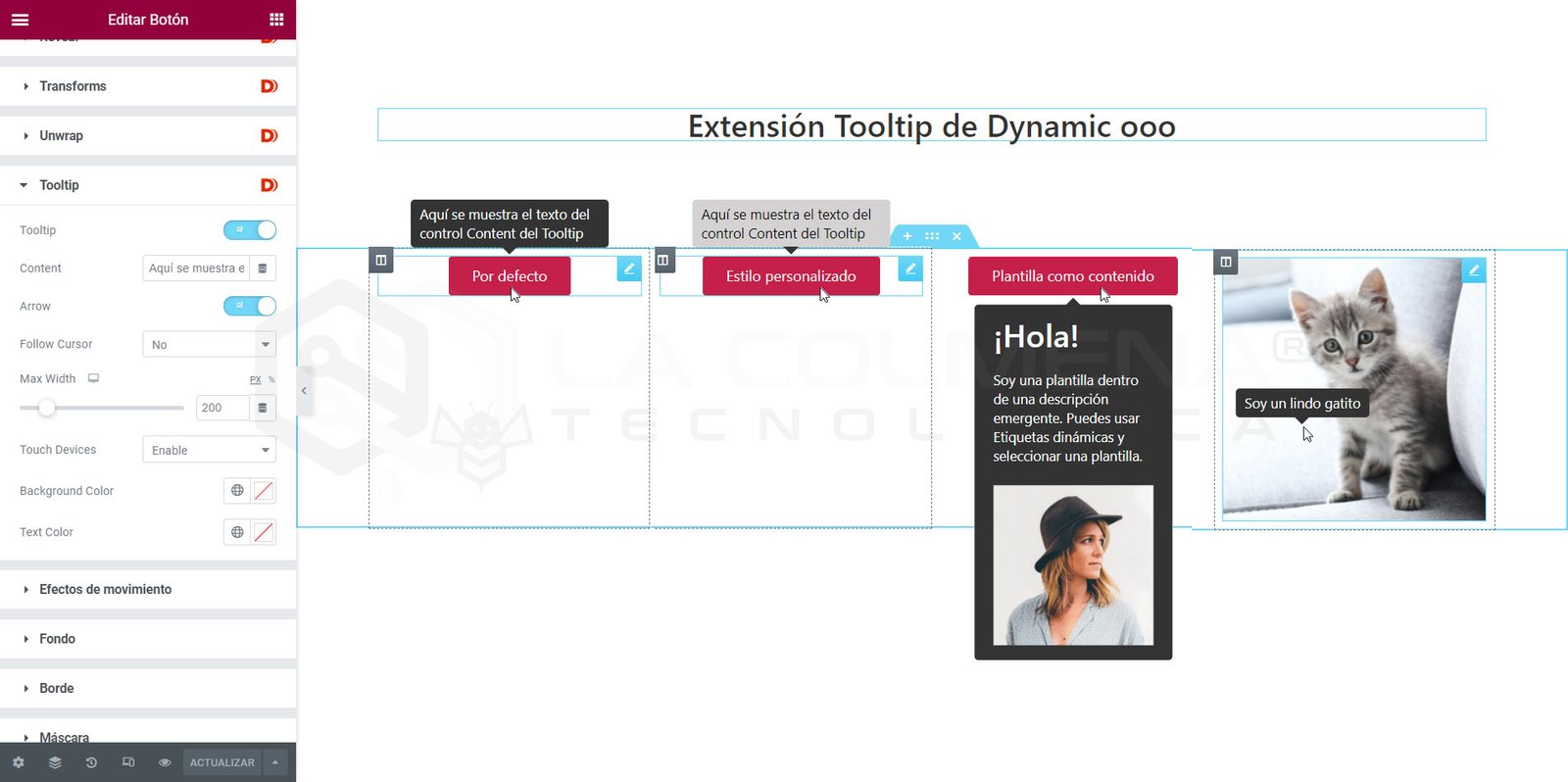
Step-by-step video
Add a Tooltip (info bubble) to any widget
Tooltips are a great way to provide additional information about an object without taking up much space. They’ve become popular in recent years as designers and developers have looked for ways to reduce clutter on their pages.
Tooltips can be used in various cases, such as:
- To shorten a long text and show more information on hover.
- Provide more information about an element on hover.
- Help users with additional supporting content.
- Inform users about specific actions.
- Show what actions icons or buttons perform.
You can add a tooltip to any widget from the Advanced > Tooltip tab.
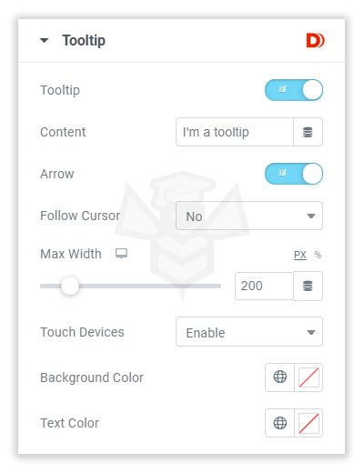
You can enable a Tooltip for any widget and even assign dynamic text for the Tooltip. Below are the available Tooltip options:
- Tooltip: with this toggle, you can enable or disable the Tooltip on a widget.
- Arrow (arrow): this will show or hide the small arrow in the Tooltip design.
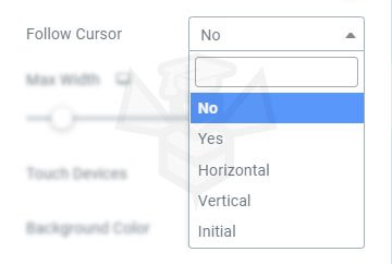
- Follow Cursor (follow cursor): you can select a cursor-follow effect when hovering over the widget.
- Max Width (maximum width): you can easily adjust the width of the bubble. If your text is longer, you can adjust the width to make it wrap to two lines or fit on one line within the Tooltip.
- Touch Devices (touch devices): you can decide whether to enable or disable tooltips on touch devices. There’s also an option that requires pressing and holding the screen to show it.
- Background Color (background color): choose the Tooltip background color.
Text Color (text color): choose the text color you want for the Tooltip.