
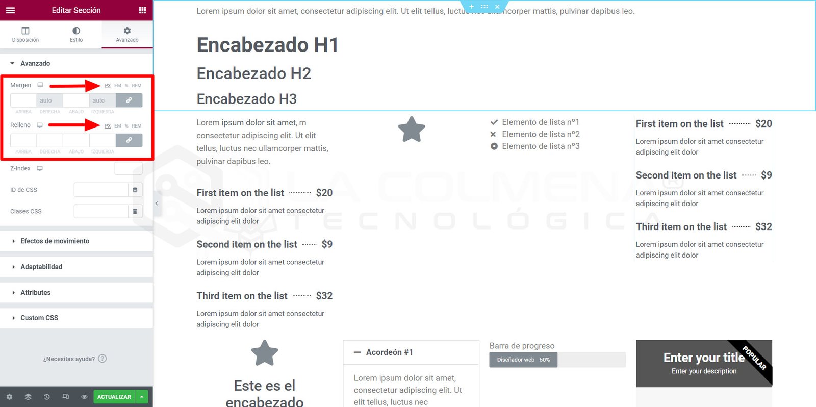
La diferencia entre px, em, rem, %, vw y vh está en la referencia que utiliza cada medida. Para decidir, piensa si el tamaño debe depender del texto, del contenedor o de la ventana. Esta tabla te ayuda a elegir sin empezar por toda la teoría de HTML.
Qué significa cada unidad y cuándo utilizarla
| Unidad | Cómo se calcula | Ejemplo de uso |
|---|---|---|
px | Píxel CSS; no tiene por qué coincidir con un píxel físico de la pantalla. | Un borde fino: border: 1px solid. |
em | En font-size, toma el tamaño heredado; en otras propiedades, el tamaño de letra del propio elemento. | Relleno de un botón que crece con su texto. |
rem | Tamaño de letra del elemento raíz, normalmente html. | Tipografía y espaciados con una referencia común. |
% | La referencia depende de la propiedad CSS. No significa siempre «porcentaje del padre». | Ancho de una tarjeta dentro de un contenedor. |
vw | Un vw equivale al 1 % del ancho de referencia de la ventana. | Una anchura ligada a la ventana, no a una columna. |
vh | Un vh equivale al 1 % de la altura de la ventana grande. | Una sección alta; en móvil conviene valorar svh o dvh. |
Consulta las definiciones de longitudes CSS en MDN y porcentajes en CSS. Las recomendaciones de uso que siguen son criterios prácticos: la elección final depende del diseño y debe comprobarse en la página.
La diferencia entre em y rem, con números
Imagina una página cuya raíz mide 16px, un contenedor con texto de 20px y un botón dentro. Estos valores muestran por qué em y rem no son intercambiables:
html { font-size: 16px; }
.contenedor { font-size: 20px; }
.boton {
  font-size: 1.2em; /* 20 × 1,2 = 24px */
  padding: 0.5em 1em; /* 12px arriba/abajo y 24px a los lados */
  margin-top: 1rem; /* 16px, a partir de la raíz */
}
El font-size del botón parte de los 20px heredados. Después, su relleno en em utiliza los 24px que ya tiene el propio botón. El margen en rem mantiene la referencia de la raíz. Este ejemplo fija medidas para hacer visible el cálculo; no propone fijar 16px como configuración obligatoria de tu web.
Unidades relativas: evita conversiones automáticas
1rem no equivale siempre a 16px. Esa equivalencia solo se cumple cuando el tamaño calculado de la raíz es de 16 píxeles. Si cambia a 20, 1.5rem pasa de 24 a 30 píxeles. Del mismo modo, antes de convertir em necesitas conocer el tamaño de letra que corresponde a la propiedad que estás ajustando.
Al anidar elementos con font-size en em, cada nivel puede tomar como referencia el tamaño ya ampliado del anterior. Si quieres una escala común entre componentes, rem suele hacer el mantenimiento más predecible. Si quieres que un botón cambie de tamaño junto con su texto, em resulta útil.
Porcentajes: comprueba primero la propiedad
Con un bloque contenedor de 800 píxeles de ancho, una tarjeta con width: 50% tiene un ancho de contenido de 400 píxeles en el modelo de caja habitual. En cambio, font-size: 150% toma el tamaño de letra heredado: si este es 20, el resultado es 30 píxeles. El mismo porcentaje responde a referencias distintas.
También hay matices en alturas, márgenes y rellenos. Un height: 100% puede no comportarse como esperas si la altura de referencia no está definida. En el flujo horizontal habitual, los porcentajes de padding y margin se resuelven respecto al ancho del bloque contenedor, incluso arriba y abajo. Por eso no conviene interpretar un relleno vertical del 10 % como el 10 % de su altura.
Si el resultado te sorprende, inspecciona la propiedad concreta y su valor calculado. El ancho de un contenedor tampoco es necesariamente el ancho de la pantalla: puede tener un máximo, columnas o rellenos.
vw, vh, svh y dvh en pantallas móviles
Para una ventana de referencia de 480 × 800 píxeles CSS, 50vw son 240 píxeles y 50vh son 400. Pero en móvil las barras del navegador cambian el espacio visible: 100vh puede dejar contenido detrás de ellas.
svhusa la altura de la ventana pequeña, con la interfaz del navegador desplegada. Es una opción estable para una cabecera que debe caber con las barras visibles.dvhsigue la altura dinámica disponible. Puede adaptarse mejor al espacio visible, aunque el bloque cambia de tamaño al mostrarse u ocultarse las barras.
En una cabecera con bastante texto, partiría de min-height en vez de una altura rígida: así el contenido puede crecer. Comprueba el resultado en un móvil real, con las barras visibles, al girar la pantalla y con texto ampliado. Las unidades de ventana se definen en CSS Values and Units.
Cuándo sigue siendo útil px
Un borde de un píxel o un pequeño detalle gráfico son usos razonables de px. Elegir esta unidad no vuelve automáticamente inaccesible una web, y usar unidades relativas tampoco garantiza que el diseño funcione. Para el texto conviene respetar las preferencias de tamaño del lector y probar el zoom; evita cajas de altura fija que lo recorten cuando crece.
Cómo elegir la unidad al trabajar con Elementor
- Texto: utiliza una escala coherente.
remfacilita compartir la referencia entre títulos, párrafos y componentes. - Botones: prueba rellenos en
emcuando quieras que acompañen al tamaño de su texto. - Columnas y tarjetas: empieza por el espacio disponible en el contenedor y comprueba sus reglas de flexbox o grid. No fuerces
100vwdentro de una columna. - Separaciones: elige valores que mantengan una relación clara. Un porcentaje puede crecer mucho en una pantalla ancha; no lo uses por defecto para cualquier margen.
- Cabeceras: comprueba el espacio del móvil y el contenido real. Una altura mínima suele tolerar mejor titulares largos que una altura fija.
Los controles y unidades disponibles cambian según la propiedad, el elemento y la versión de Elementor. Esta guía explica CSS; no presupone que todos los campos del editor ofrezcan las mismas opciones. En la documentación de unidades de Elementor puedes contrastar el funcionamiento del selector.
Comprueba el resultado antes de darlo por terminado
- Revisa escritorio y móvil con el texto y las imágenes definitivos.
- Amplía el texto y el zoom; comprueba que los botones sigan visibles y no haya recortes.
- Busca desplazamientos horizontales y revisa el contenedor que los provoca.
- En el inspector del navegador, compara el valor escrito con la medida calculada.
Fundamentos: raíz, contenedores y elementos hijos
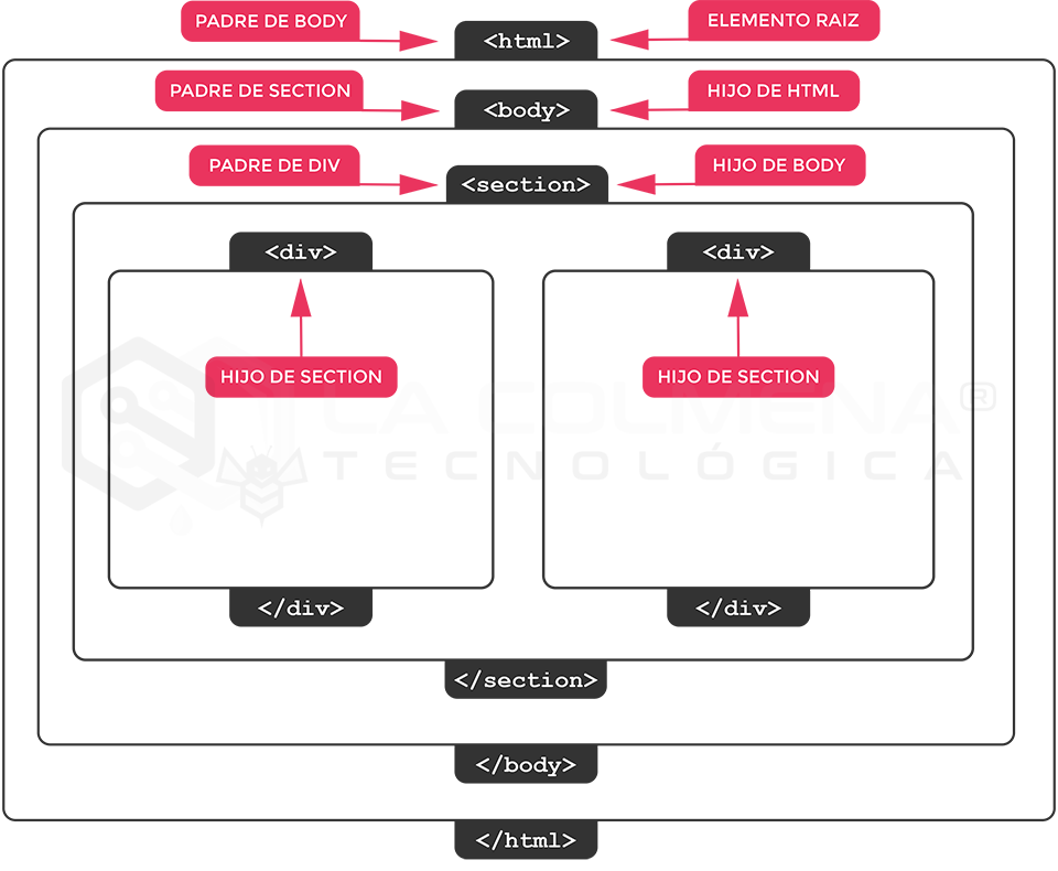
El elemento html es la raíz del documento. Dentro suelen encontrarse head, que contiene metadatos y referencias a recursos, y body, donde se organiza el contenido visible. Un contenedor puede incluir títulos, párrafos y otros contenedores: esa relación ayuda a entender la herencia y las medidas relativas.
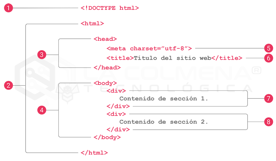
Un elemento padre es el que contiene directamente a otro. El bloque contenedor que utiliza CSS para calcular algunas medidas puede depender además de su posición y del diseño aplicado; no hay que confundir ambos conceptos. La declaración <!DOCTYPE html> identifica el tipo de documento: no es un elemento con contenido ni una etiqueta que necesite cierre.
Vídeo paso a paso
Conservamos el vídeo como apoyo visual. Consulta las aclaraciones de esta guía para los cálculos de em, los porcentajes y las unidades de altura del móvil.
Revisión del contenido: 29 de septiembre de 2026. Referencias: MDN, especificación CSS y documentación de Elementor enlazadas en cada apartado.