Web editing interface with multiple call-to-action buttons. Column settings view in a visual builder.
Table of contents
This content uses an older Elementor structure based on sections and columns. Elementor has now adopted a container system, which improves design flexibility and organization.
Step-by-step video
What is a Section?
Sections in Elementor are container-type building blocks. Within sections are columns, where we finally place our design widgets. A section always has at least one column.
Sections can be manipulated and designed using the options in the Elementor Panel on the left or by right-clicking the Section handle and choosing from the contextual menu that appears.
Right-Click Options
If you want to duplicate a section, right-click its section handle and click Duplicate from the contextual menu. You can also copy and paste a section elsewhere in the same document you are editing, or even into another document (page, template, …) as long as it’s from the same website, using the Copy and Paste options. You can also copy and paste only the style (without the content) from one section to another. Click Save as Template to save the section as a template that can be inserted anywhere later. Clicking Navigator here will open the Navigator already configured for that particular section. And, of course, clicking Delete here will remove the section.
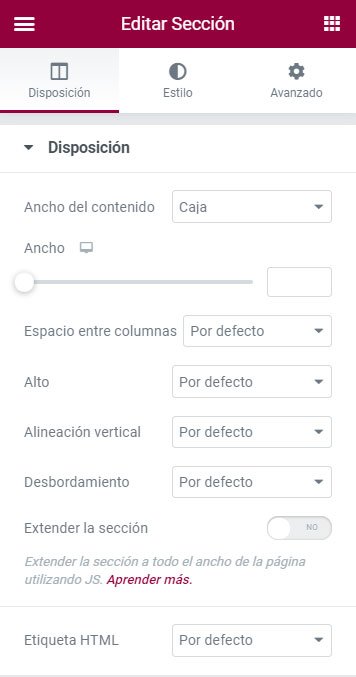
If you click Edit Section, the column options will be displayed in the Elementor Panel on the left with all the following options available to you.
Layout Tab
If you click Edit Section, the column options will be displayed in the Elementor Panel on the left with all the following options available.
Content Width: Set the Content Width to Boxed or Full Width. If you select Boxed, the default content width will be 1140px (this can be changed from the hamburger menu (top left) > Site Settings > Layout), although you can use the slider to set your preferred width.
Columns Gap: The default gap between columns is 20px, but you can change it from this selector (No Gap, Narrow, Extended, Wide, Wider, and Custom).
Height: By default, the section adjusts its height to the content, but it has two more options:
Fit to Screen: The section adjusts to fill the entire screen.
Column Position: If you select Fit to Screen, this other option will be displayed, allowing you to vertically align the column position (stretch, top, middle, bottom).
Minimum Height: This option allows you to set a minimum height using the slider, but keep in mind that if you set a value smaller than the height already occupied by the content, it will have no effect.
Column Position: If you select Fit to Screen, this other option will be displayed, allowing you to vertically align the column position (stretch, top, middle, bottom).
Vertical Align: Allows you to set the vertical alignment of the widgets you add, but for this to make sense, the section height must be set to Fit to Screen or a minimum height greater than the height occupied by the existing content within it. In any case, the Column has another control identical to this vertical alignment that takes precedence over this one, so my recommendation for vertical alignment is to use the column’s vertical alignment control.
Overflow: Select how to handle content that overflows your container. Default allows overflow. Select Hidden to hide overflowing content. For example, when using Motion Effects from the Advanced tab, content can enter from outside the column via an animation. If this control is set to Default, the animated element will be shown throughout its path. However, with Hidden Overflow, we will only see the animated element within the delimited area of the column. This is shown much more clearly in the video tutorial for this topic.
Stretch Section: Forces the section to stretch to the full page width using JavaScript. We will only use this option if we have set the control at the beginning of this box Content Width to Full Width and it has no effect.
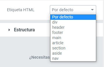
HTML Tag: Sets an HTML tag for your section. This point is further developed below.
How to Add HTML Tags to My Section and Column
HTML tags are essential for your site’s SEO. Using them correctly will have a positive impact on your website’s traffic.
If you are editing the header, use the header
Go to your section or column settings.
Under Layout, click the HTML Tag dropdown menu.
Choose the tag you want to use.
These are the different types of HTML tags you can choose from:
<div>: Defines a division. This tag allows grouping several block elements (paragraphs, headings, lists, tables, divisions, etc.).
<header>: Defines a header for a document or section. This is useful when you are creating a header template. It can contain elements related to a website’s header such as the logo, a navigation menu, a search form, …
<footer>: Defines a footer for a document or section. This is useful when you are creating a footer template. It represents a footer that typically contains information about the website author, links to legal texts, and copyright.
<main>: Represents the main content of a document. This content should be unique to the document, excluding any content that is repeated across other documents such as sidebars, navigation links, copyright information, site logos, and search forms (unless, of course, the main function of the document is a search form).
<article>: Represents an independent and self-contained composition of content, for example, it could be a forum post, a magazine or newspaper article, a blog entry, a user comment, an interactive widget or gadget, or any other independent content item.
<section>: Designed to contain a thematically defined part of a document. The contents of a section element are usually preceded by a heading. Authors usually use the section element to divide a long document into chapters, to separate different tabs in an application, or to thematically divide sections of a document (ads section, latest articles section, related links section, etc.).
<aside>: Represents a section of a page that consists of content indirectly related to the main content of the document. These sections are often represented as sidebars or as inserts and contain a marginal explanation such as a glossary definition, indirectly related items, or advertising.
<nav>: Represents a portion of a page whose purpose is to provide navigation links, either within the current document or to other documents. Common examples of navigation sections are menus, tables of contents, and indexes.
Structure Tab
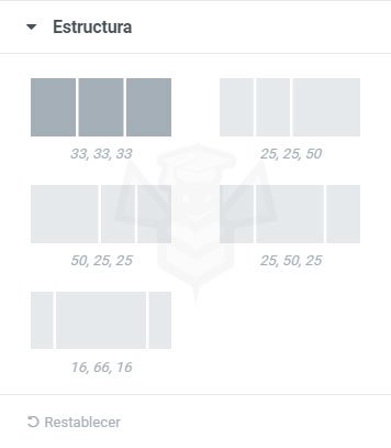
When a section has more than one column, we can use these predefined column distribution settings. The numbers indicate the percentage width of each column relative to the total of 100.
Regardless of the structure we select, which by default is equal-width columns, we can define the column width to our liking, either by dragging in the intermediate space between columns or by entering a number in the Column Width text box within the options of a Column’s Layout tab.
What is a Column?
A column in Elementor is a vertical division of a section. As we mentioned earlier, columns are children of sections, and a section can have from one to several columns. Columns are the final container for the widgets that will make up the design of a document in Elementor.
If a document has more than one column, these can have equal or different widths. In the configuration box of a section, there is the Structure tab where we can select from several predefined options, but we can also set predefined widths for each column expressed as percentages of 100%. For example, we have three columns and set one to 22.5%, another to 27.5%, and the last to 50%.
The height of a column is determined by the size of the section. For a column to have a height greater than its content, we must set a minimum height for the section or a
Right-Click Options
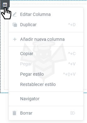
If you want to add a new column or duplicate a column, right-click a column handle and choose +Add New Column or Duplicate from the contextual menu. You can also copy and paste a column into another section using the Copy and Paste options, or you can copy and paste only the style (without the content) from one column to another.
Clicking Navigator will open the Navigator already configured for that particular column. And, of course, clicking Delete here will remove the column. If the section only has one column and you delete it, it will be removed but replaced by another empty column.
If you click Edit Column, the column options will be displayed in the Elementor Panel on the left with the following options available.
Layout Tab
Column Width (%): Set the width of your columns, keeping in mind that it is a percentage of the total 100%. Increasing the size of one column will reduce the adjacent column.
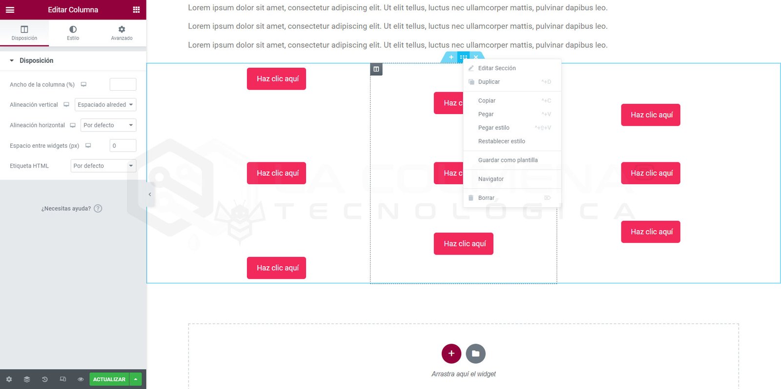
Alineación vertical: establezca la alineación vertical de los widgets que contenga la columna. Para que esta alineación tenga sentido se tienen que pasar dos cosas. Una que el alto de la sección sea mayor que el espacio que ocupa el contenido y esto se estableciendo el alto de la sección a un tamaño mayor que el que ocupa el contenido, ya sea seleccionando la opción Ajustar a pantalla o Altura mínima. Y otra que tras establer Ajustar a pantalla o Altura mínima establezcamos la opción Posición de la columna en Estirar.
Default: Widgets are aligned to the top.
Top: Widgets are aligned to the top.
Middle: Widgets are aligned to the middle.
Bottom: Widgets are aligned to the bottom.
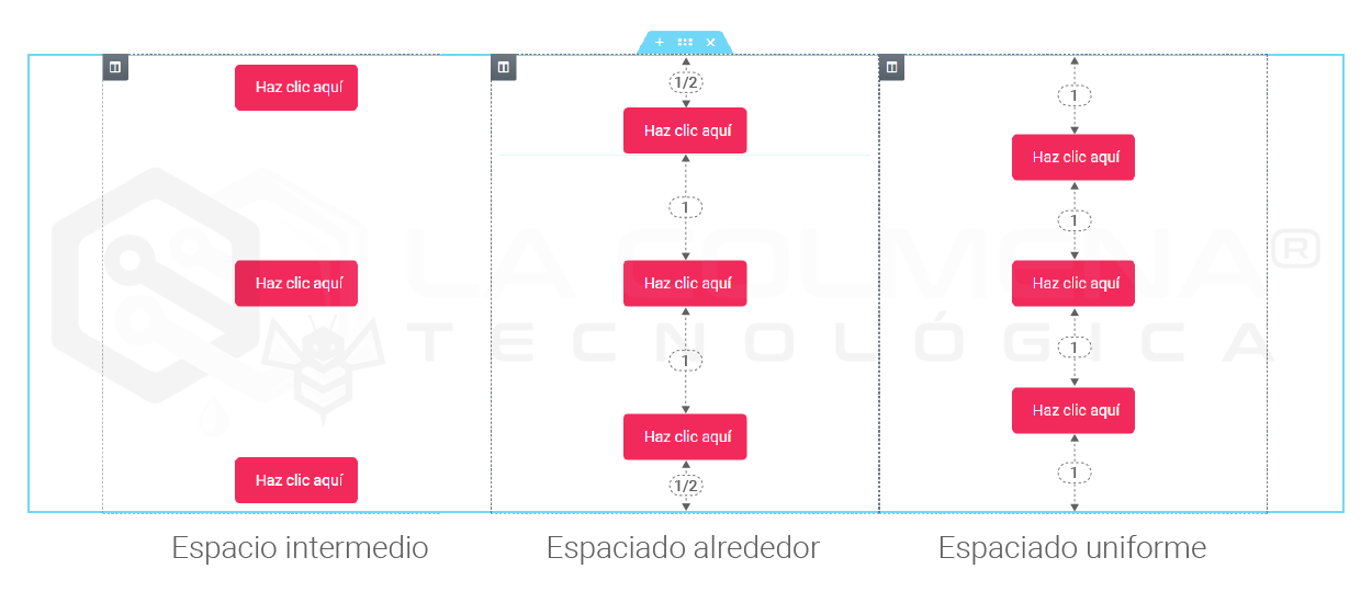
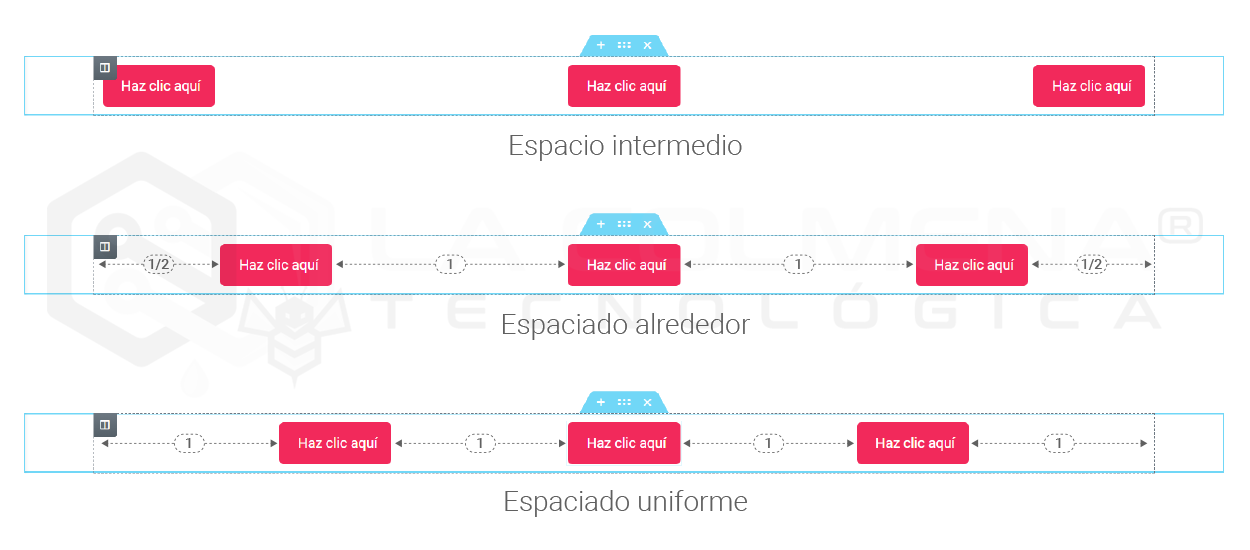
Space Between: Widgets start and end at the column edge, with equal space between them.
Space Around: Widgets have equal space, and the edges have half the size of the space between widgets.
Space Evenly: Widgets have equal space between, before, and after them.
Horizontal Align: This extends the inline positioning capability and allows you to horizontally align inline widgets placed in the same row. For this alignment to be possible, the widgets you want to align must have Width: Inline (auto) set in the Advanced > Positioning > tab so that the widgets do not occupy the entire screen width and can be aligned horizontally.

 and click Duplicate from the contextual menu. You can also copy and paste a section elsewhere in the same document you are editing, or even into another document (page, template, …) as long as it’s from the same website, using the Copy and Paste options. You can also copy and paste only the style (without the content) from one section to another. Click Save as Template to save the section as a template that can be inserted anywhere later. Clicking Navigator here will open the Navigator already configured for that particular section. And, of course, clicking Delete here will remove the section.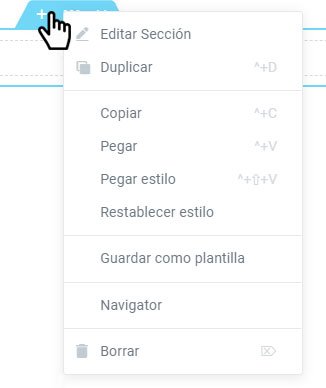

 settings.